
Mobile app icons are the first point of contact between your app and the potential customer. It is a critical aspect of creating a successful mobile application. Mobile app image plays an important role in App Store Optimization (ASO), as it is the first impression of your app, so having a well-designed icon can significantly impact whether they decide to download your app or not.
A well-designed app icon can help attract potential customers, increase downloads, and improve brand recognition. In this ultimate guide to mobile app design, we will discuss everything you need to know about creating a well-crafted mobile app icon, including essential elements, best practices, techniques, and common mistakes to avoid.
So, let’s get started.
What is an app icon?
An app icon is a graphical symbol or image that represents a mobile application. It serves as a visual identifier for the app. The app icon will have a unique design, color scheme, and shape, and is intended to be distinctive and recognizable to users. Most often the color scheme of the icon will be according to the theme of the app and what it is about.
The app icon is an important part of not only the ASO of the mobile app on the app store but also for the branding of your company. It can attract or send away new users that come to your app because it is the first point of contact with your potential customers. So if your app does not make a good first impression then you will lose your chance to get more users.
Why does your app icon matter?
Users often make snap judgments about an app based on its icon. If the icon design is unclear, cluttered, or unattractive, users are likely to assume the application is of poor quality or not worth their time.
Brand Recognition and Recall
The icon is a critical part of establishing an app’s brand identity. A good icon design reinforces brand recognition and recall, making it easier for users to identify and remember the app.
Options for Creating Your Own Custom App Icons:
There are different options for creating your own custom mobile app icon design:
1. Design the icon Yourself:
If you are a creative person and have any design skills, you can create your own icon design by using software such as Adobe Photoshop, Illustrator, or Sketch. This gives you full control over your app icon design in this way you can create icons according to your thoughts because you know what you want to make out of your brand.
2. Use Icon Generators:
If you don’t know how to work on the above-mentioned software and you don’t have a budget to hire a person for your icon design. The other way is to use the online icon generators, with them you can design a custom icon without having any design skills. You can find so many of these icon generators on the internet some of them are Canva, Iconfinder, and Flaticon.
3. Hire a Freelance Designer:
If you want a high-quality mobile app icon design then you can hire a designer that can help you to create icons. You can find freelance designers on platforms like 99Designs, Upwork, etc.
4. Hire an agency:
If you have a good budget and want more services than just designing the mobile app icon design, services like marketing and handling App Store Optimization (ASO) then an agency is the best option for you. Because they can provide you with a lot more services than just designing the app icon.
Whichever option you choose, make sure your app icons are visually appealing and consistent with your app’s branding and style.
Best Practices for Designing Mobile App Icons
Before starting on a mobile app icon design, consider the following best practices to create an effective icon that represents your brand and appeals to your target audience.
- Know Your Audience
Understanding your target audience is crucial in designing an icon that resonates with them. Research your user demographics, interests, and preferences to create an icon that speaks to them.
- Research Your Competitors
Research your competitors’ icons to identify industry trends and avoid creating a generic or redundant design. A unique icon design can help your application stand out from the crowd and attract more users.
- Consider Your Branding and Marketing Strategy
The icon should reflect your brand’s voice and image. Consider your branding and marketing strategy when designing the icon and create a look and feel that aligns with your brand’s overall visual identity.
Tips for Choosing Colors, Shapes, and Styles
The Psychology of Colors in App Icon Design
Colors play a critical role in app icon design. Different colors evoke different emotions and create different perceptions. For instance, blue represents trust, security, and professionalism, while red conveys passion, excitement, and urgency. Choose colors that align with your app’s purpose and personality.
Choosing the Right Shape for Your App Icon
App icon shape also affects perception and recognition. A round or circular shape helps to convey a friendly, approachable, and welcoming app. A square or rectangular shape suggests structure, organization, and professionalism. Choose a shape that aligns with your app’s personality and values.
Finding the Right Style for Your App Icon
There are various app icon styles, from flat design to skeuomorphism to realism. Choose a style that aligns with your brand identity and messaging. Consider your audience’s preferences and current design trends to create an app icon that is both timeless and modern.
App Icon Design Guidelines:
Both Apple App Store and Google Play Store have specific guidelines for app icons. For example, Apple requires app icons to be 1024 x 1024 pixels and in the PNG format. They also require that the icon have rounded corners and that the background is transparent. Google, on the other hand, requires app icons to be 512 x 512 pixels and in PNG format. They also require that the icon be square with no rounded corners. In addition to these technical requirements, there are also design guidelines that you should follow. For example, it is recommended that you avoid using text in your app icon and that you avoid using too many colors.
Essential elements of an effective app design:
Effective icons have specific characteristics that make them visually appealing, recognizable, and memorable.
Simplicity is Key
A simple and straightforward design is often the most effective. A cluttered or complicated icon can be confusing and difficult to understand, detracting from the user experience.
Clarity and Readability
The icon should be clear and readable, even in smaller sizes. Avoid using small text or intricate details that may get lost in the small size.
Scalability
App icons should be designed to scale well to different sizes and resolutions. A design that looks good at a larger size may not necessarily work at a smaller size, so it’s essential to take this into account when creating an icon.
Common Mistakes to Avoid while designing mobile app
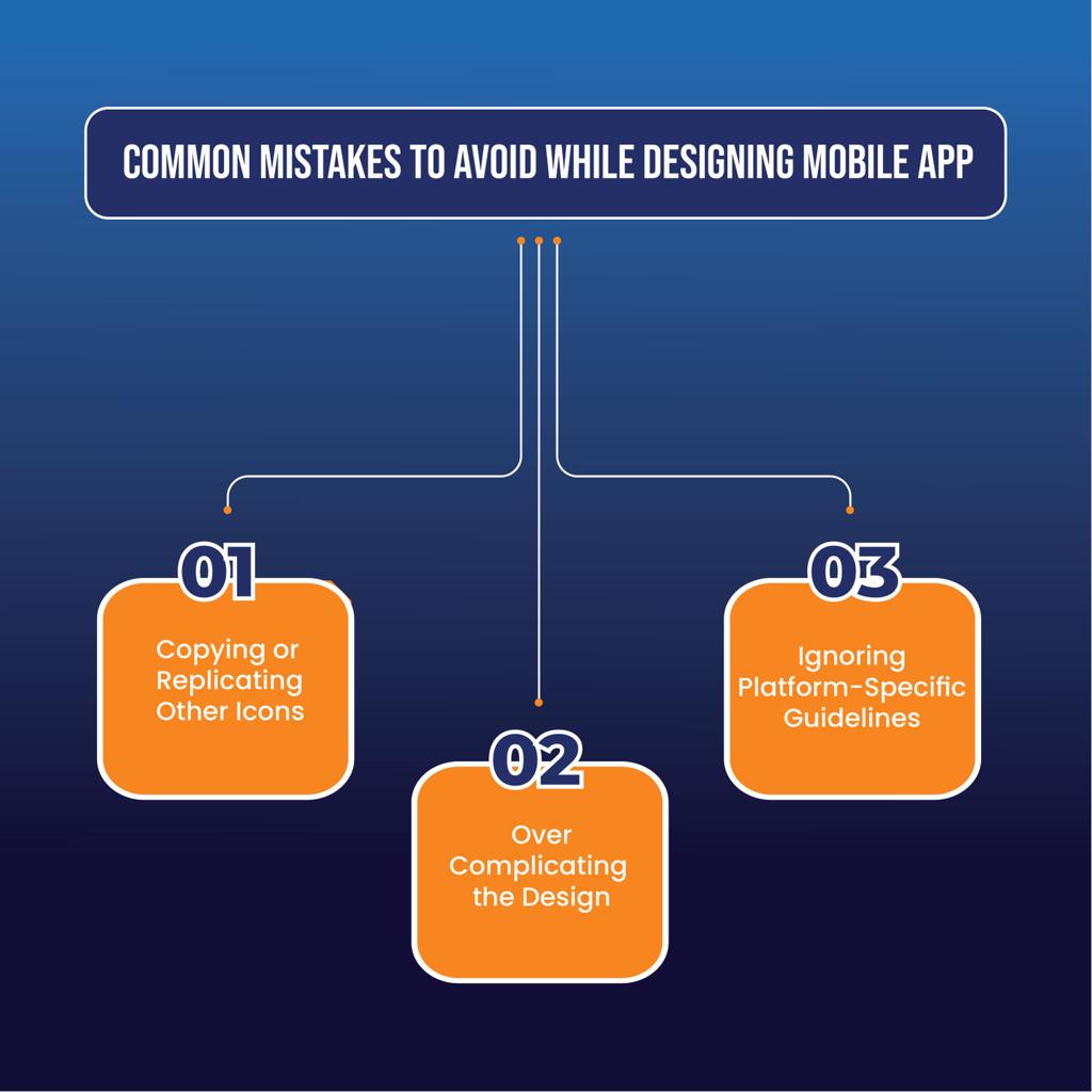
Designing a great app icon is not just about creating a beautiful graphic. Avoid these common mistakes to ensure that your icon stands out and remains relevant for years to come.
- Copying or Replicating Other Icons
Designing an app icon inspired by other popular apps may seem like an excellent tactic, but it’s counterproductive. Users are looking for innovative and unique experiences, and a copied icon may give the impression that your app is a knock-off.
- Overcomplicating the Design
While creativity is essential in app icon design, too much of it can lead to a cluttered and confusing design. When designing your icon, keep it simple and straightforward. Remember, less is more.
- Ignoring Platform-Specific Guidelines
Both Apple and Google have their unique design guidelines for app icons. Paying attention to these guidelines when creating your app icon ensures that it fits seamlessly into the ecosystem of its respective platform. Ignoring these guidelines can result in a lack of consistency and a suboptimal user experience.
Best Practices for Submitting Your App to App Stores
When submitting your app to app stores, it’s important to follow best practices to ensure that your app is approved and visible to users. Make sure your app icon meets all guidelines and requirements set forth by the app stores, and consider using A/B testing to determine which version of your app icon performs best. Additionally, consider optimizing your app’s metadata, such as the app description and screenshots, to improve your app’s visibility and appeal to potential users.
Conclusion:
Designing a mobile app icon is a critical aspect of creating a successful application. This ultimate guide has provided you with the necessary knowledge and insights to craft an impressive and attention-grabbing icon. Remember, your app icon is the first impression users have, so it needs to be visually appealing and effectively represent your brand or app’s purpose. For more information about ASO click here.

Awesome 👍🏻